Hello! I’m Jonathan — based in Auckland, I’m a brand and marketing designer with expertise in UI design.
I’m passionate about developing innovative and technical designs that deliver engaging experiences, both emotionally and visually.
Alexion Design System – AstraZeneca
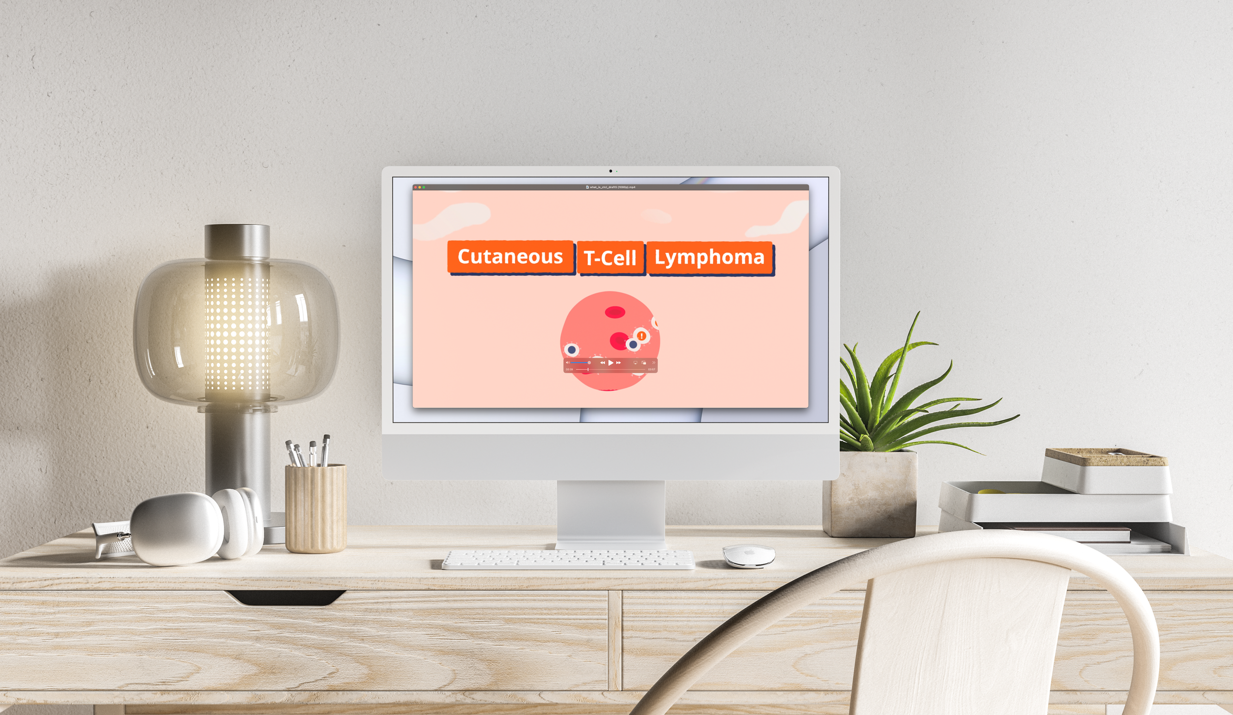
CTCL Answers – What is CTCL?

Midjouney exploration
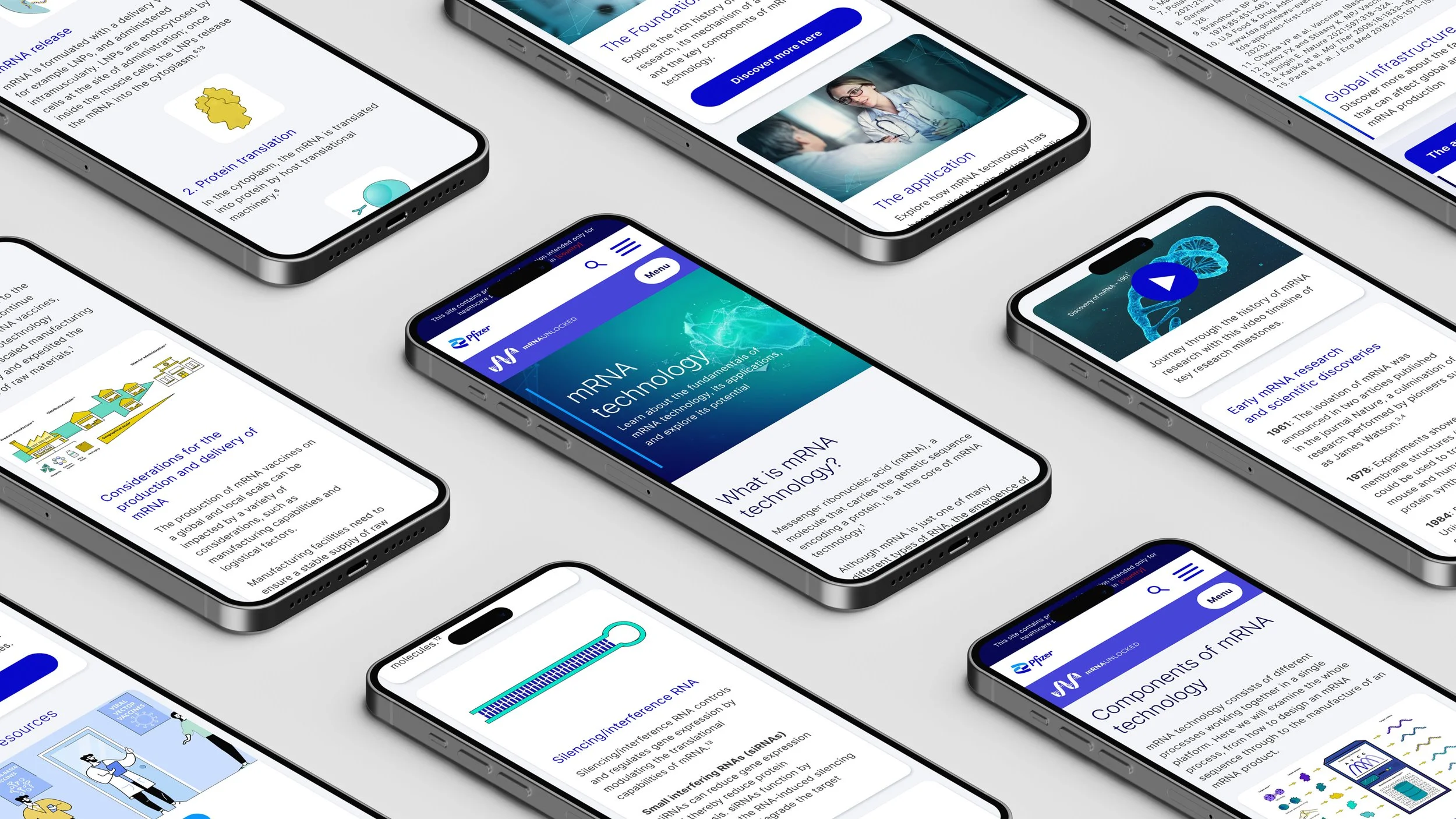
mRNA Unlocked Site – Pfizer
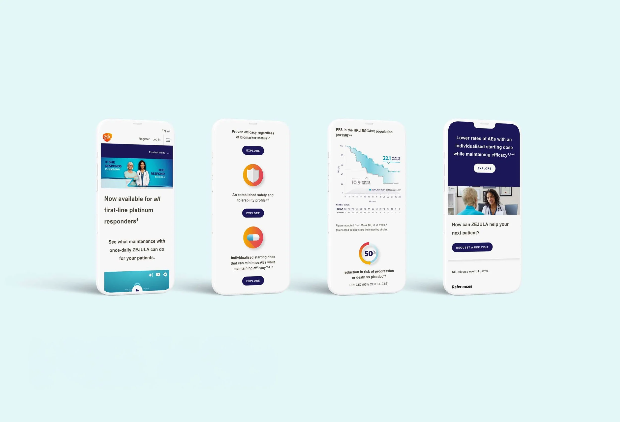
ZEJULA GSK Pro Site – GSK
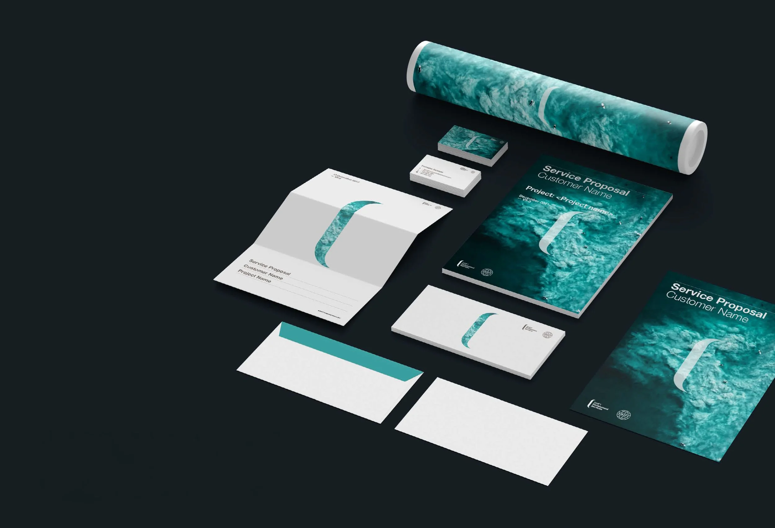
SWIFT Professional Services Branding – SWIFT

Tradesman Two – JCB
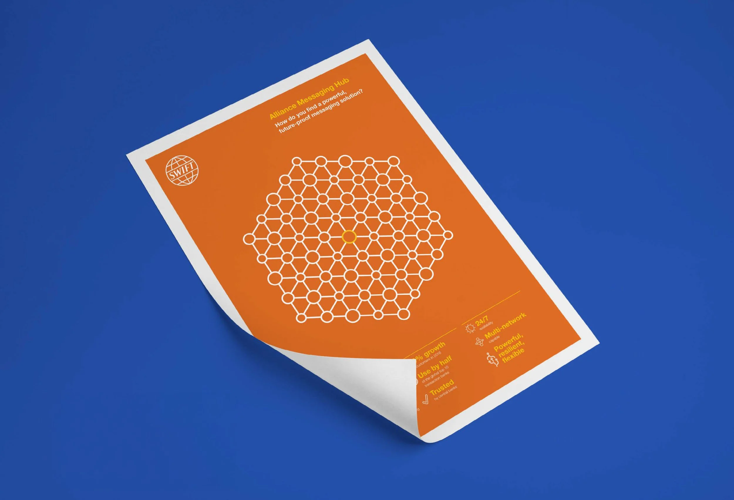
SWIFT Sybos Social Posts + Poster – SWIFT
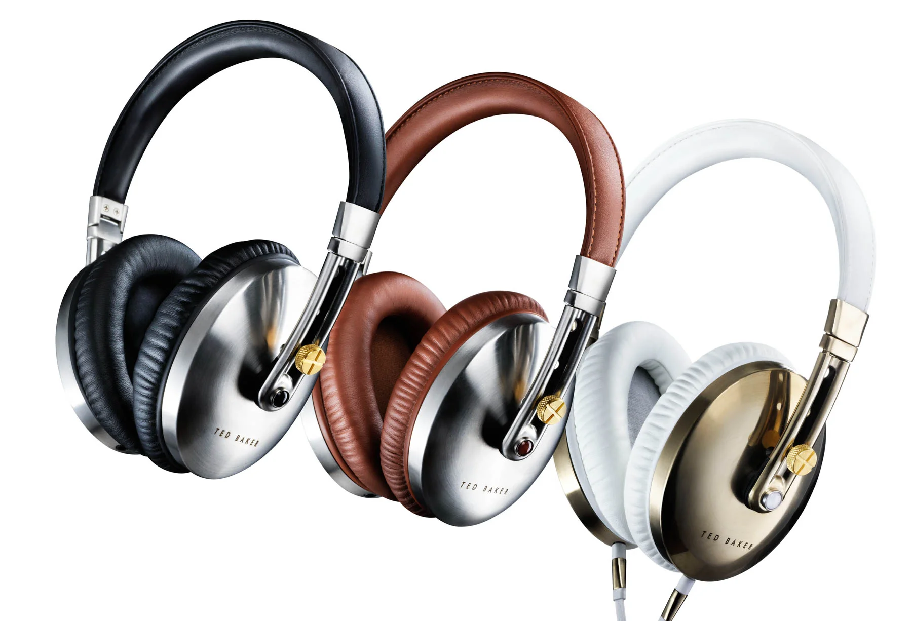
Studio Photography – Ted Baker
Falling – Boots

Signature Collection Box – McDonald's
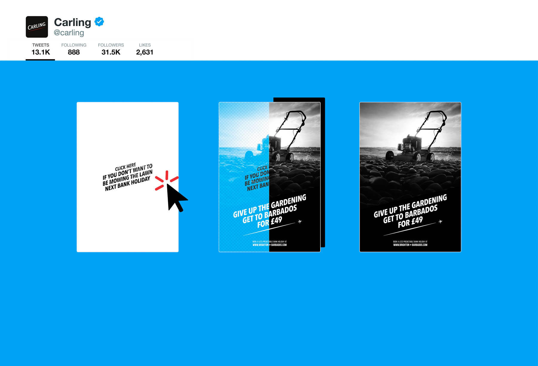
Click to Reveal (Twitter) – Carling
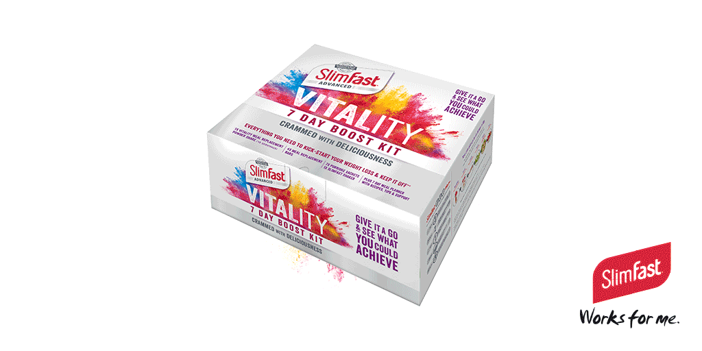
Vitality – Slimfast
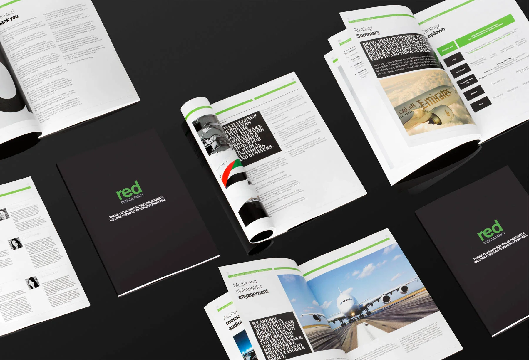
Working with Red (New Business)

Carling – Social Media Posts
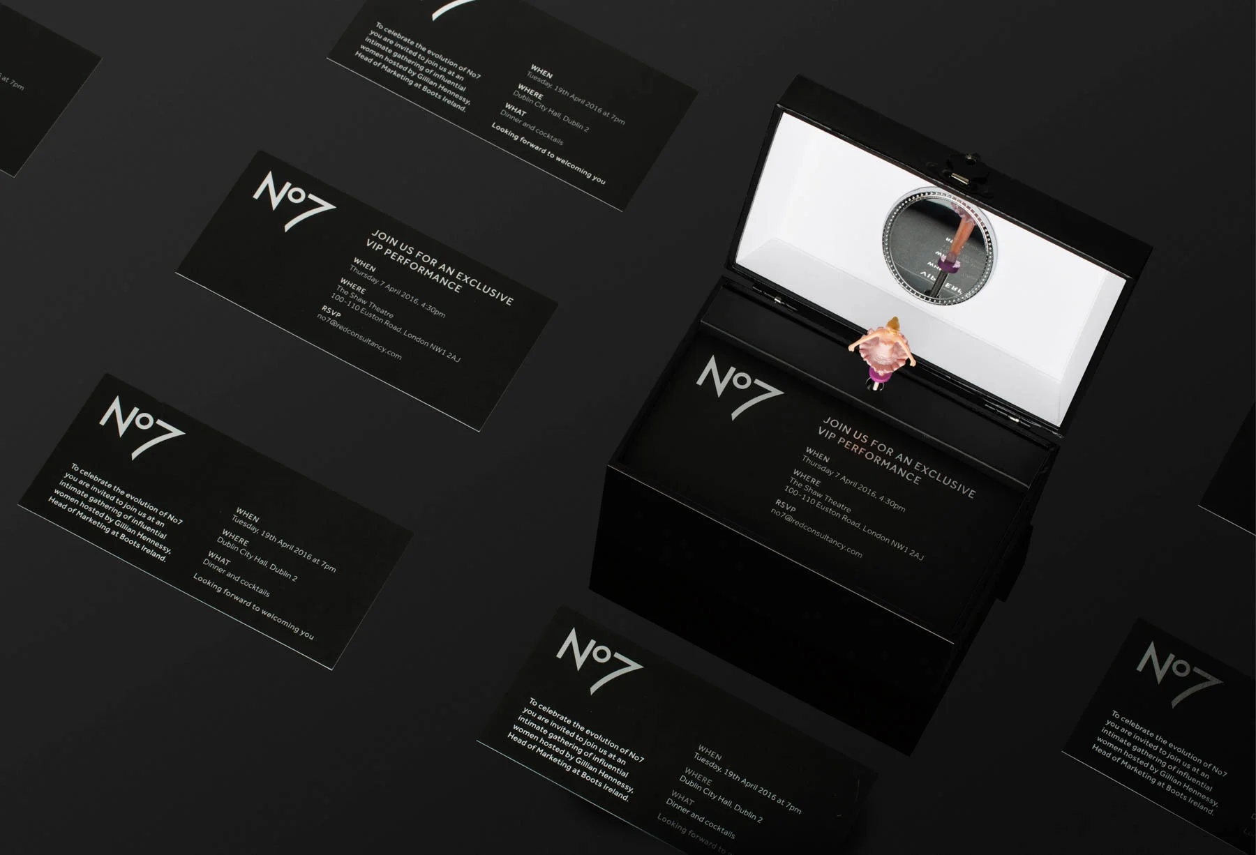
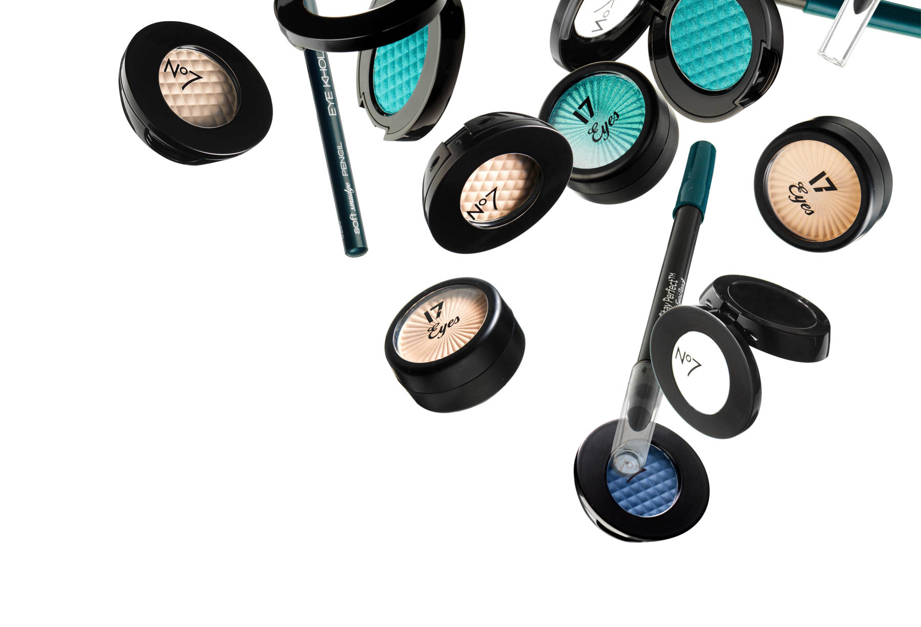
Lift and Luminate – Boots No7

New Business – Lego